The Vancouver Heritage Foundation sets an example for finding historic homes’ true colours.
By Diane Switzer & Donald Luxton
One of the most baffling questions heritage homeowners face is how to choose an appropriate colour scheme for the home’s exterior. There are hundreds of colours available, but until there were recently few places to turn for help finding your home’s true historical colours.
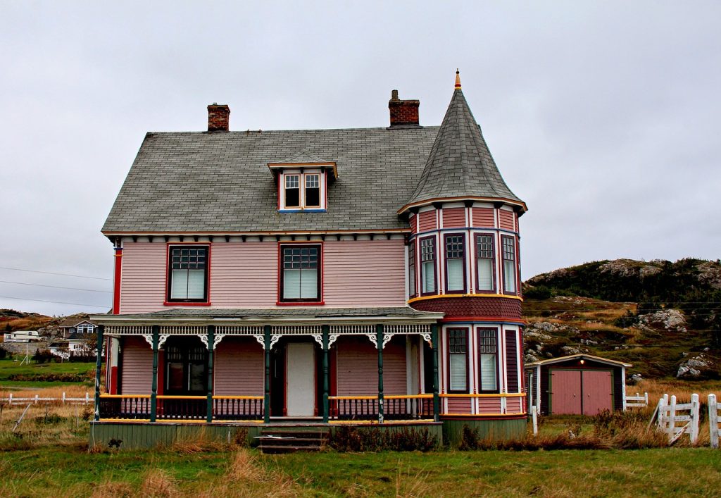
Too many homeowners make decisions about colour they later regret. Many painstaking restoration efforts have been given “ho-hum” or banal appearances through overly cautious approaches. Others look fussy and garish because they use too many colours.
Paint colours, like fashion and architecture, have changed over time due to style and technology. When your home was built there was a range of colours that suited it. If it had been built 20 years later, an entirely different colour scheme might have seemed appropriate.
Work Through Your Historical Society
In 1999, the Vancouver Heritage Foundation was brainstorming ideas for its inaugural grant program. Given the city’s large stock of wood frame houses and the volume of inquiries about appropriate historic colours, they decided that an exterior paint program would be an effective way to assist heritage homeowners. The True Colours program now provides historically accurate paint for five houses each year. It was developed as a corporate/charitable partnership with Benjamin Moore Paints. The program has since won both provincial and civic heritage awards and inspired home maintenance and restoration — as well as copycat colour schemes — far beyond the individual paint projects.
Listen to Your Home
Archival images may help you restore porches and finials, but black and white photography won’t tell you much about paint colours. Experience has proven that the best place to start looking for an authentic colour scheme is right in your own back yard — the building itself.
When researching the True Colours program, Benjamin Moore’s lab took samples of homes’ original paints by chipping away more recent layers to get to the first coat. They then analyzed the sample under a microscope to determine what colour the paints would have been before 100 or 150 years of abuse from the elements. The results were Strathcona Mahogany, Kitsilano Gold, Pendrell Green, Point Grey and over 30 other colours named after local streets and neighbourhoods that make up the palette of Benjamin Moore’s brochure, “Historical Vancouver True Colours.”
Determine Placement
Another important aspect of the research was determining where to place colours on individual architectural elements. In total contrast to the “Painted Ladies” approach (where every detail is picked out in contrasting hues) we now know that almost every house built in Vancouver during the Victorian and Edwardian eras used a maximum of three colours. Almost every paint scheme breaks down into a body colour, a trim colour and a window sash colour.
Finishing Touches and Surprising Results
There are always logical places where colour starts and stops — just follow the trim. Also, historic paint was oil-based — it had a high-gloss finish — so don’t be afraid to go for a more glossy look.
The True Colours program’s findings were fascinating because some of them contradicted people’s expectations. For example, white paint was never used in Vancouver during the Victorian and Edwardian eras and window sashes were almost always painted a dark colour, usually black. Discoveries like these make finding your home’s true colours a fascinating exercise.


